For as long as I can remember I have always loved anything in print, whether it be books, comics, magazines, brochures or pretty much any kind of printed ephemera. A life in design was always in the cards (I collected them too!) for me and I am glad it’s a path I chose. I didn’t go to college or university. Everything I learned in the formative years of my working life was self taught. In latter years the internet came along and I subsequently discovered NAPP and KelbyOne as it is today. I love design and specifically, what we used to call, Desk Top Publishing and also typography and fonts.
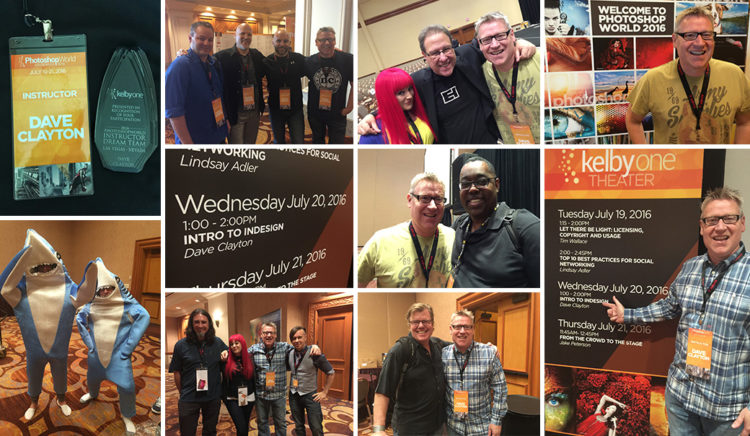
Photography was never my speciality, it’s an art form I love and that I follow, it’s those great photos which provide the imagery I need to make great printed content. They go hand in hand but it’s graphic design for me all the way. This passion led to me being asked by Scott to teach my first ever class at Photoshop World this past July called “Introduction to InDesign” on the Expo floor. It truly was an honour to represent as an instructor alongside the very people I had learned from over the past 10 or so years.
Not many people had realised either that, at the age of 50, my presentation was my first ever public speaking ‘gig.’ I decided that if you are going to start somewhere, start big!!
Initially I was going to present a ‘How To…’ class but actually, the thing I found myself talking about the most when it comes to design and InDesign was explaining what InDesign actually was. So in this blog I would like to use the basis of my presentation “Introducing InDesign” to talk about why I love what I do and how I try to encourage others to indulge in InDesign and a little graphic design.
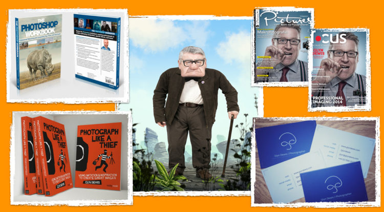
On a personal note, It’s fair to say that I am a very lucky man. I have achieved some awesome personal goals over the past 7 years, most notably the experiences, opportunities and friendships I have developed. Meeting Glyn Dewis was a huge turning point. Scott introduced us almost 6 years ago and a lot of people think we’ve known each other a lot longer, but that’s just how well Scott got that introduction right! Anyway, cutting a very fulfilled and action packed story short that includes a bit of modeling, designing my favourite logo, and appearing on the cover of magazines, I have also been privileged enough to design the covers for his two books, The Photoshop Workbook (Peachpit) and the upcoming “Photograph Like A Thief” (Rocky Nook), both covers laid out and designed in InDesign (as are both books). The cover design to PLAT I designed in Illustrator but it’s all laid out in InDesign. That’s because this is what InDesign is for. It’s pretty much the best layout tool and I think the best tool in the CC arsenal!
So, the main question I get when I’m talking about this is “What’s InDesign for?”, not “how do I use it?”
My answer is pretty much “Everything, everywhere!”
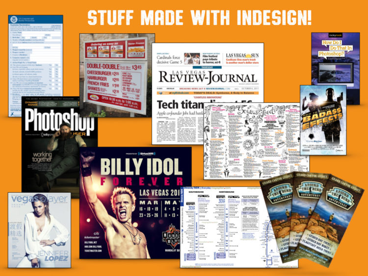
At least, to me, is what it feels like. Just arriving in Las Vegas for Photoshop World, I had to fill in a TSA entry card, designed in InDesign. The magazines, brochures, attraction flyers, menus, newspapers, books I saw in the airport, the huge advertisements on the walls of the airport – all InDesign (maybe Quark but you get my point). The imagery may have been created in Photoshop or Illustrator but I can bet you at least 90% was laid out in InDesign. That’s because it is THE tool for the job.
The reason I am so passionate about talking to photographers about this is because there is money to be made for you (if you are a photographer). I had a conversation at the Photography Show in the UK last March with a photographer who asked what I did, assuming I was also a photographer, and I surprised them when I said I was just a graphic designer. And interestingly (a common response when I had many conversations like this) I generally get, “Ah, I need a graphic designer to make some stuff for me.”
I am a firm believer in the old adage, “give a man a fish and he’ll eat for a day, teach a man to fish and he’ll eat forever…”
Of course I would love to take on lots and lots of work from photographers who need my services, but do you know what? I would rather teach or encourage a photographer to understand InDesign, what it can do and what they could make themselves with some basic skills. I love you guys, it’s hard enough trying to be a working photographer without having to spend out on collateral for yourself. The conversation pretty much went like this…
He said he’d done a shoot for a local business that was selling a specific product. They’d spent most of the day there shooting the owner and staff, products, and the shop. They only made about £50 ($75) because they really wanted to get some work and hoped that they’d get referrals for more work. He admitted he has a lot of time spent waiting for the emails or phone calls for more work but they don’t come that often. We both know that’s a dangerous path. So I asked what the photos were for. “Probably some flyers or a brochure and the website.” So I explained that, as a designer, I could and probably would make at least five times what they got paid for doing that work. I can’t do that without those images and yet I’ll get a better pay day sat at my desk.
So we talked about using that ‘down time’ to learn some InDesign basics, there are classes on Kelby One and Terry White has some great content on YouTube. They did exactly that and I got an email a couple of months later telling me that they’d watched my classes and some others, got a book and the next time they got a photography gig for a client they were also able to secure the design work and successfully created some flyers, a reward card, a couple of shop window posters and a simple price list. Nothing super high end, BUT good enough for the client who had a modest budget. A relationship now developed with the customer and future work to follow because the photographer can offer a more complete package. I am talking starting off with small, local businesses though because using an application and understanding design are two very big differences, much like owning a great camera and understanding how to make great images. It takes time, but we all have an eye for design and there’s enough content to be inspired by (just read Glyn Dewis’ recent post here on Scott’s blog!)
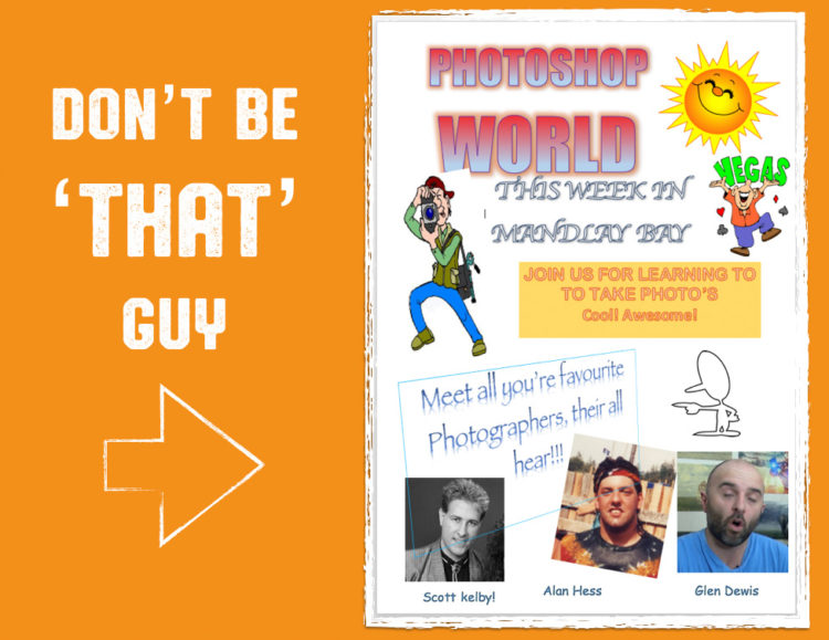
I actually made a fake Photoshop World poster to make a point in my class (see below) – we’ve all seen these awful creations made in Word with Clipart and Wordart – in fact this took me longer to do in Word than if I had done a proper version in InDesign!! You know this is awful and you don’t have to be a designer to know that. And the fact you realise this means you know in your mind you can come up with something better. Practice, practice, practice!
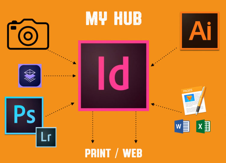
As I mentioned previously, InDesign is my creative hub. Everything else feeds it. No matter what I create, if it’s going to print, it’s going in InDesign. Because of this, my local printer loves me!
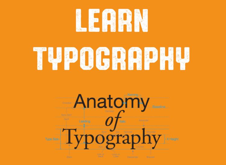
The other strength of InDesign is typography. In my experience I have always had better control of type in InDesign over Photoshop and Illustrator. Understanding a bit of typography helps and Scott Kelby has a great class on this on KelbyOne, Corey Barker also has a great one on Typekit – if you have the Creative Cloud then you’ll know about Typekit but I won’t go into that now. Look at typography and text in magazines and books, look how certain styles work, how they look on the page and how easy content is to read. Look at composition and white space. You know what your eye likes to see so use that as inspiration.
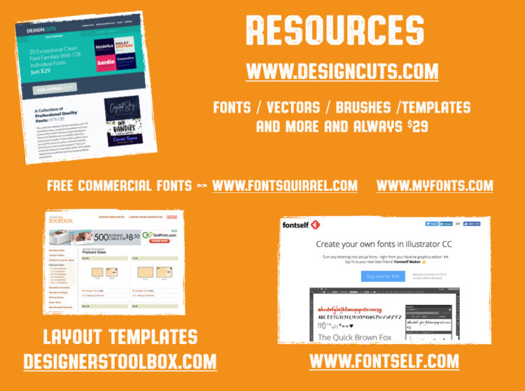
And where else can you get fonts other than Typekit or what’s on your PC and Mac already installed? Back in the day we all used to download the usual 1001 fonts off the internet and use them in everything. Something a lot of people don’t realise is that you can’t just use any font for any commercial project. Much like taking images from Google to use in your work, fonts are licenced in the same way images are. You can very easily get excellent commercial fonts very cheaply and free. For the past two years I have been buying commercial font bundles from DesignCuts.com– a mix of stylish, decorative and corporate style fonts and a bunch of amazing design resources, mostly only $29 per bundle. Seriously, check them out.
If you want some free commercial fonts then try FontSquirrel.com or MyFonts.com, both offer some cool fonts, all licensed for commercial use (but always please read the licensing when using for client work). If you are brave enough to make your own then get hold of FontSelf.com – you can make fonts in Illustrator and easily convert to usable fonts for all your programs. A Photoshop version is imminent! There’s no excuse to not be able to use great fonts for great projects and you won’t break the bank doing so!
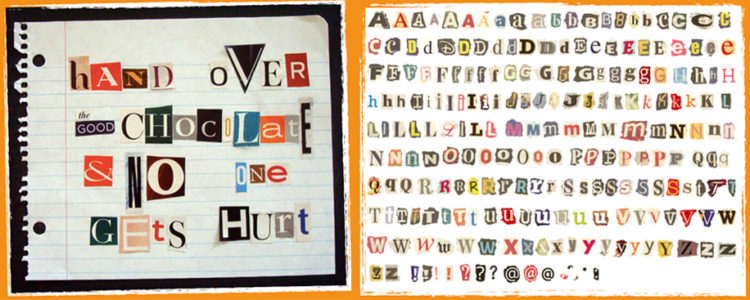
Speaking of typography my next slide in my presentation raised a few eyebrows… “When I was growing up I wanted to be a kidnapper…”
Seems like a dangerous and unethical career choice! But all I was interested in was being the guy who made the ransom notes. That took more skill than anything in my book. You can’t send a ransom note using comic sans, you shouldn’t use the same font twice in a word, you had to mix the colours, the cases, the serifs and the non serifs. This was serious stuff to me! I used to cut out letters from my parent’s magazines and newspapers and make my own; I used them to make posters and signs for our bedrooms. I’m generation X – born before the days of computers – the equivalent of shooting film!! Yeah, that old :-)
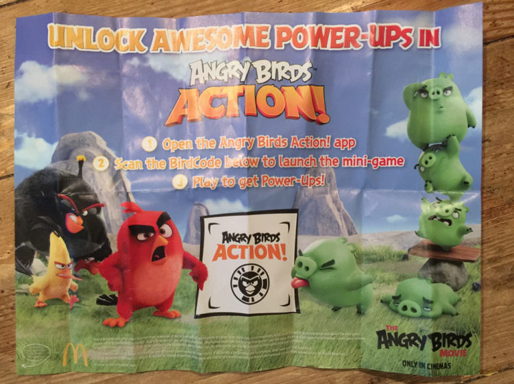
Another thing I touched on was being a versatile designer. For every eye catching poster there’s an “admin” type job that also needs doing. What do I mean by this? I went to a fast food restaurant (don’t judge me) after the movies one day with my family and on the tray of food was an A3 sized piece of paper with an advert for an Angry Birds promotion, someone designed that and everyone who ate in that restaurant saw this artwork.
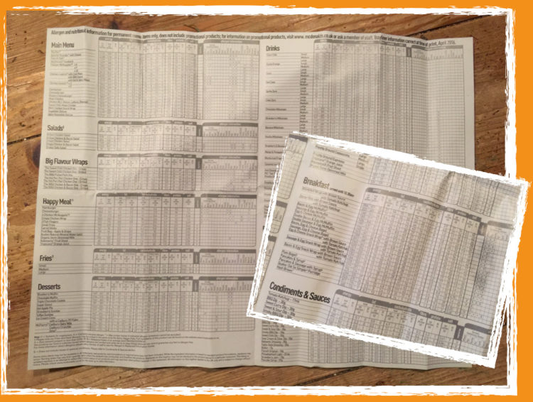
Awesome for them. However, I turned this sheet over and on the back was a HUGE spreadsheet type layout of all the nutritional facts for all the food.
This was also laid out in InDesign and equally important. If you can do this kind of unexciting work, you’ll still be working! Do the bread and butter stuff and you’ll be in demand. There’s an abundance of work out there that needs doing, and whilst it’s nice to get the glamorous posters, there’s way more layout based work going. It still pays the same bills!
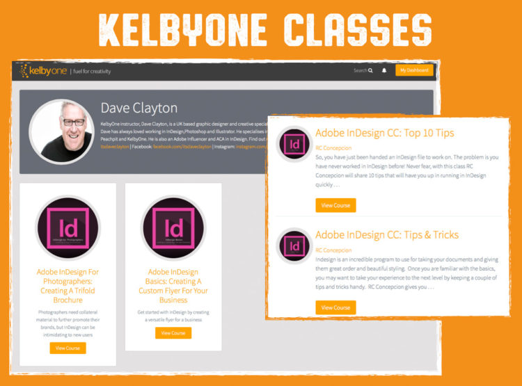
As I said before, I’ve got two classes on KelbyOne to help you learn InDesign and type projects. Please give them a look and apologies for the accent!
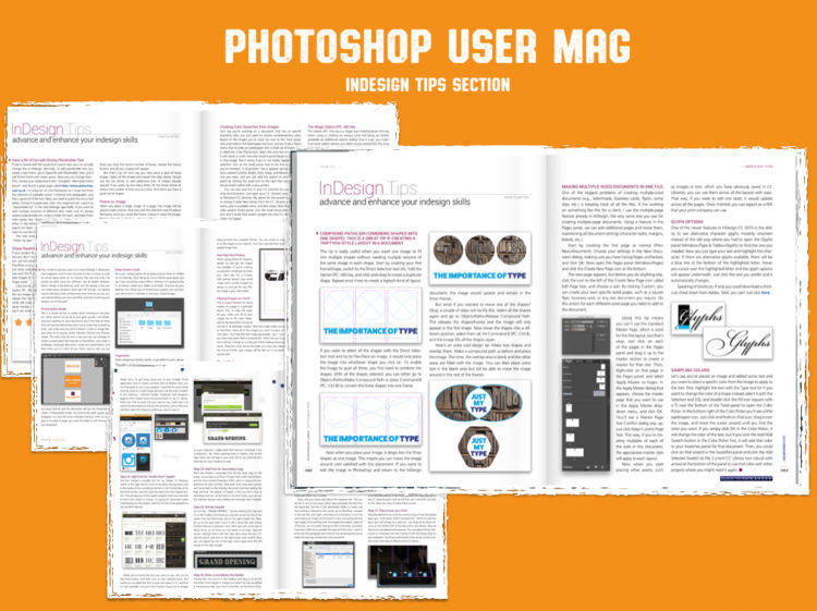
Photoshop User Magazine also has a two page InDesign tips page that I write every month and instructors like Terry White have some great content on YouTube. There is no excuse!
If you want to find out more about me, I’m on Facebook, Instagram, Twitter as @itsdaveclayton and I have a new blog at ItsDaveClayton.com where I will be posting more InDesign and graphic design content over the coming months. If I am really lucky, I’ll maybe be back at Photoshop World again real soon teaching more of what I love….yep, InDesign.
So let’s get out there, make some stuff, learn it, love it and share it!
Thank you for sticking me if you made it this far. Have a great Wednesday!
The post It’s Guest Blog Wednesday featuring Dave Clayton! appeared first on Scott Kelby's Photoshop Insider.
from Scott Kelby's Photoshop Insider http://ift.tt/2bSaFqv
via IFTTT


No comments:
Post a Comment